
CSS Performance Optimization & Rendering Engines
CSS is a render-blocking resource. Until the browser finishes downloading and parsing all external stylesheets in the <head>, it cannot paint a single pixel on screen. Optimizing CSS directly improves Google Core Web Vitals — Largest Contentful Paint (LCP), Interaction to Next Paint (INP), and Cumulative Layout Shift (CLS) — driving higher search engine rankings and lower bounce rates.
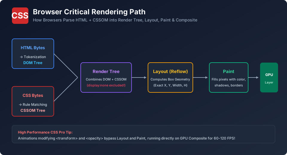
Reflow vs. Repaint vs. Composite: The Three Pipeline Stages
| Stage | What the Browser Calculates | Properties Triggering It | Performance Cost |
|---|---|---|---|
| 1. Reflow (Layout) | Recalculates geometric dimensions and positions of all affected elements. | width, height, margin, padding, font-size, top, left |
Extremely Expensive! (Can freeze scrolling on mobile CPUs) |
| 2. Repaint | Redraws visual pixels onto the screen without altering geometric dimensions. | color, background-color, box-shadow, visibility |
Moderate |
| 3. Composite | Delegates visual changes directly to the device GPU without touching the CPU. | transform, opacity |
Ultra-Fast! (60 – 120 FPS buttery smooth) |
Modern Game-Changer: content-visibility: auto
Imagine an article with 50 long sections and 200 comments. Normally, the browser calculates layout and paints all 200 comments on page load, even though the user only sees the top banner. Setting content-visibility: auto instructs the browser to skip rendering off-screen sections until the user scrolls near them, reducing initial page render times by up to 70%!
/* Huge Performance Boost for long blog articles and comment sections */
.comment-section, .article-footer {
  content-visibility: auto;
  contain-intrinsic-size: 0 500px; /* Estimates height to prevent scrollbar jumping */
}
The will-change Property: Use with Restraint!
will-change hints to the browser engine ahead of time that a specific property will animate, prompting the browser to promote the element to its own dedicated GPU layer:
/* Promote animated modal to GPU layer during interaction */
.animated-drawer {
  will-change: transform, opacity;
}
Warning: Avoid will-change: all!
Never apply will-change to dozens of elements or set will-change: all;. Each promoted GPU layer consumes significant device VRAM, which will crash mobile browsers and exhaust system memory.
Explore Related CSS Tutorials & Next Steps
Boost your CSS and front-end development proficiency by exploring these closely connected topics:
Understand margins, borders, padding, content and the universal box-sizing fix.
Master 1D alignment, justify-content, align-items, flex-wrap and responsive flow.
Build powerful two-dimensional grid layouts with template areas and fr units.
Eliminate styling conflicts and master selector weights from 0,0,0,1 to !important.
Frequently Asked Questions (FAQ) - Student & Interview Review
Q1. What is Critical CSS?
Q2. Why are expensive selectors bad for performance?
Q3. What does contain-intrinsic-size do?
Q4. How can I measure CSS performance in Chrome?


You may also like this!
© Veewom.com. | Managed by PinePL
