
CSS Subgrid & Nested Track Alignment
In CSS Grid Level 1, child items inside a grid container had independent formatting contexts. If a grid item contained its own nested children (such as an image, title, paragraph, and button inside a card), those internal elements could not align with the internal elements of neighboring cards. CSS Subgrid (CSS Grid Level 2) permanently solves this limitation.
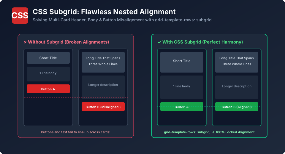
The Multi-Card Alignment Problem
Consider three product cards in a row. Card 1 has a short 1-line title, while Card 2 has a long 3-line title. Without subgrid, Card 2's button is pushed down, while Card 1's button floats higher up. The row of buttons looks ragged, jagged, and unprofessional.
The Subgrid Solution (grid-template-rows: subgrid)
By specifying grid-template-rows: subgrid, the child card opts into the parent grid's tracks, locking titles, descriptions, and action buttons into identical horizontal lines across all cards:
/* Parent Grid Container */
.cards-container {
  display: grid;
  grid-template-columns: repeat(3, 1fr);
  /* Each card spans 3 rows: [title] [description] [button] */
  grid-template-rows: auto 1fr auto;
  gap: 20px;
}

/* Individual Card Opts Into Subgrid */
.card {
  display: grid;
  grid-row: span 3;           /* Spans across 3 parent row tracks */
  grid-template-rows: subgrid;/* Inherits parent track dimensions! */
  background: #ffffff;
  padding: 20px;
  border-radius: 8px;
}
Explore Related CSS Tutorials & Next Steps
Boost your CSS and front-end development proficiency by exploring these closely connected topics:
Understand margins, borders, padding, content and the universal box-sizing fix.
Master 1D alignment, justify-content, align-items, flex-wrap and responsive flow.
Build powerful two-dimensional grid layouts with template areas and fr units.
Eliminate styling conflicts and master selector weights from 0,0,0,1 to !important.
Frequently Asked Questions (FAQ) - Student & Interview Review
Q1. What browsers support CSS Subgrid in 2026?
Q2. Can an element use subgrid for rows and independent tracks for columns?
Q3. What happens if a browser does not support subgrid?
Q4. Does subgrid inherit gaps from the parent grid?


You may also like this!
© Veewom.com. | Managed by PinePL
