
CSS Positioning Schemes (Static, Relative, Absolute, Fixed & Sticky)
By default, HTML elements render in normal document flow: block elements stack vertically and inline elements sit side-by-side. The position property allows developers to break elements out of normal flow to construct fixed navigation headers, floating badges, slide-out sidebars, and sticky table headers.
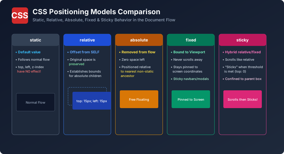
The 5 CSS Positioning Schemes
| Value | Removed from Normal Flow? | Positioned Relative To What? | Original Space Preserved? |
|---|---|---|---|
| static | No (Default) | Normal document flow (top/left/z-index ignored). |
Yes |
| relative | No | Its own original default position. | Yes (Original space remains reserved) |
| absolute | Yes | Nearest ancestor with position other than static (or <html>). |
No (Collapses to 0 height in document flow) |
| fixed | Yes | The browser viewport window. Never scrolls with page. | No |
| sticky | Hybrid | Scrolls normally until crossing threshold, then sticks to viewport within parent. | Yes |
The Classic Pattern: Relative Parent + Absolute Child
The most ubiquitous pattern in web design is anchoring an absolute badge or close button to the top-right corner of a card:
/* Parent Container establishes coordinate boundaries */
.product-card {
  position: relative;
  width: 300px;
  border: 1px solid #e2e8f0;
  border-radius: 8px;
  overflow: hidden;
}

/* Child is pinned exactly 12px from top-right corner of the parent */
.badge-sale {
  position: absolute;
  top: 12px;
  right: 12px;
  background-color: #d22b2b;
  color: #ffffff;
  padding: 4px 10px;
  border-radius: 4px;
  font-weight: bold;
}
Creating a Sticky Header with position: sticky
Sticky headers scroll normally with the page until they reach the top of the viewport, where they latch on seamlessly:
.sticky-navbar {
  position: sticky;
  top: 0;                     /* Threshold where sticking activates */
  z-index: 1000;              /* Stays above scrolling content */
  background: #ffffff;
  box-shadow: 0 2px 4px rgba(0,0,0,0.05);
}
BCA Exam Question: Why did my sticky element stop sticking?
Question: Name two common CSS reasons why a position: sticky element fails to stick during scroll.
Answer: (1) The developer forgot to define a threshold offset (like top: 0;); without an offset, sticky cannot activate. (2) An ancestor container has overflow: hidden, overflow: auto, or overflow: scroll, which traps the scrolling context.
Explore Related CSS Tutorials & Next Steps
Boost your CSS and front-end development proficiency by exploring these closely connected topics:
Understand margins, borders, padding, content and the universal box-sizing fix.
Master 1D alignment, justify-content, align-items, flex-wrap and responsive flow.
Build powerful two-dimensional grid layouts with template areas and fr units.
Eliminate styling conflicts and master selector weights from 0,0,0,1 to !important.
Frequently Asked Questions (FAQ) - Student & Interview Review
Q1. What is the difference between fixed and sticky positioning?
Q2. How does absolute positioning determine its coordinate boundary?
Q3. How do you center an absolutely positioned element?
Q4. What are the inset shorthand properties?


You may also like this!
© Veewom.com. | Managed by PinePL
