
- Home
- Tutorials
- Bootstrap Tutorial
- Grid Columns & Offsets
Bootstrap 5 Grid Columns: Alignment, Offsets, Reordering & Nesting
Once you have mastered the basic 12-column grid, advanced frontend layouts demand finer control over alignment, offsets, visual ordering, and nested grids. In this class, we dive into the advanced column manipulation capabilities baked into Bootstrap 5.
1. Vertical Column Alignment in Rows
Because rows are flex containers (display: flex), you can align child columns vertically using flexbox alignment utility classes on the .row:
<!-- Align items to top, center, or bottom -->
<div class="container">
  <!-- Top Alignment -->
  <div class="row align-items-start" style="height: 150px; background: #f8fafc;">
    <div class="col">Top Aligned</div>
  </div>

  <!-- Center Alignment (Most Popular for Hero Sections) -->
  <div class="row align-items-center mt-3" style="height: 150px; background: #f8fafc;">
    <div class="col">Vertically Centered</div>
  </div>

  <!-- Bottom Alignment -->
  <div class="row align-items-end mt-3" style="height: 150px; background: #f8fafc;">
    <div class="col">Bottom Aligned</div>
  </div>
</div>
2. Column Offsets (offset-*)
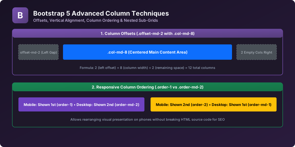
Offset classes shift columns to the right by increasing the column's margin-left. For example, to center an 8-column article on desktop, shift it by 2 columns (offset-md-2), because 2 (left offset) + 8 (content) + 2 (remaining space) = 12 columns:
<div class="container">
  <div class="row">
    <!-- Perfectly Centered 8-Column Box -->
    <div class="col-12 col-md-8 offset-md-2">
      <div class="p-4 bg-white shadow-sm rounded text-center">
        <h3>Centered Content Block</h3>
        <p>Shifted 2 columns to the right using .offset-md-2 on tablets and desktops.</p>
      </div>
    </div>
  </div>
</div>
3. Responsive Column Reordering (order-*)
Modern mobile-first design often requires displaying content in a different visual sequence on phones than on desktops. Use the order-* utility to control visual hierarchy without modifying your HTML document source order (essential for SEO and screen reader accessibility):
<div class="container">
  <div class="row">
    <!--
      Mobile: Text appears FIRST (order-1)
      Desktop: Text appears SECOND (order-md-2)
    -->
    <div class="col-md-6 order-1 order-md-2">
      <h3>Product Description</h3>
      <p>Read description first on mobile, but see image on left on desktop.</p>
    </div>

    <!--
      Mobile: Image appears SECOND (order-2)
      Desktop: Image appears FIRST (order-md-1)
    -->
    <div class="col-md-6 order-2 order-md-1">
      <img src="images/logo.png" class="img-fluid" alt="Product Image">
    </div>
  </div>
</div>
4. Nesting Grids inside Columns
To nest content within the grid, simply insert a new .row inside an existing column. The nested row immediately creates a fresh 12-column sub-grid spanning the width of its parent column:
<div class="container">
  <div class="row">
    <div class="col-md-8 bg-light p-3">
      <h4>Main Column (col-md-8)</h4>
      <!-- Nested Sub-Grid Row -->
      <div class="row">
        <div class="col-6 bg-primary text-white p-2">Nested 50%</div>
        <div class="col-6 bg-success text-white p-2">Nested 50%</div>
      </div>
    </div>
    <div class="col-md-4 bg-secondary text-white p-3">
      <h4>Sidebar (col-md-4)</h4>
    </div>
  </div>
</div>
Explore Related Bootstrap Tutorials & Next Steps
Strengthen your responsive web design mastery by studying these connected classes:
Review 12-column basics, row wrappers, and mobile-first column spans.
Compare traditional 12-column flexbox grid with native CSS grid.
Fine-tune layout spacing using m-*, p-*, gx-*, and gy-* utilities.
Build real-world multi-column layouts for desktop, tablet, and mobile.
Frequently Asked Questions (FAQ) - Student & Interview Review
offset-*-0 to reset an offset. For example, offset-sm-2 offset-lg-0 applies a 2-column offset on landscape phones and tablets, but resets the offset back to 0 on large desktop monitors.
order-first (sets order: -1), order-last (sets order: 6), and numbered classes from order-0 through order-5 across all responsive breakpoint infixes (e.g. order-md-1).
order-* class only changes visual rendering on the screen via CSS flexbox.
Next Step in Your Bootstrap Learning Path:
Advance your practical frontend engineering skills with the next topic in our synchronized curriculum.
Continue to Class 7: Native CSS Grid → Previous: ← Class 5: 12-Column Grid System | Full Syllabus


You may also like this!
© Veewom.com. | Managed by PinePL
