
- Home
- Tutorials
- Bootstrap Tutorial
- Navs, Tabs & Pills
Bootstrap 5 Navs, Tabs, Pills & Dynamic Tabbed Interfaces
Tabs and pills allow you to organize dense, related information into compact, interactive panes on a single webpage (e.g. user profile settings, product specifications, customer reviews, and code samples). Bootstrap 5 handles tab pane switching with pure CSS and vanilla JavaScript transitions.
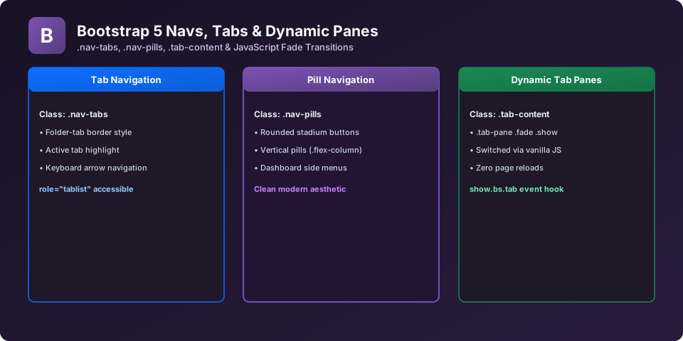
1. The Base .nav Component
All nav components begin with a <ul class="nav">, containing <li class="nav-item"> and <a class="nav-link"> children:
<ul class="nav justify-content-center border-bottom pb-2 mb-4">
  <li class="nav-item"><a class="nav-link active" aria-current="page" href="#">Overview</a></li>
  <li class="nav-item"><a class="nav-link" href="#">Syllabus</a></li>
  <li class="nav-item"><a class="nav-link" href="#">Practicals</a></li>
  <li class="nav-item"><a class="nav-link disabled" aria-disabled="true">Certificate</a></li>
</ul>
2. Dynamic JavaScript Tabs (.nav-tabs)
To create interactive clickable tabs, pair .nav-tabs with a matching .tab-content container. Each button requires data-bs-toggle="tab" and a data-bs-target pointing to its respective tab pane:
<!-- Tab Navigation Headers -->
<ul class="nav nav-tabs" id="myTab" role="tablist">
  <li class="nav-item" role="presentation">
    <button class="nav-link active" id="home-tab" data-bs-toggle="tab" data-bs-target="#home-tab-pane" type="button" role="tab" aria-controls="home-tab-pane" aria-selected="true">HTML5 Basics</button>
  </li>
  <li class="nav-item" role="presentation">
    <button class="nav-link" id="profile-tab" data-bs-toggle="tab" data-bs-target="#profile-tab-pane" type="button" role="tab" aria-controls="profile-tab-pane" aria-selected="false">Bootstrap 5</button>
  </li>
  <li class="nav-item" role="presentation">
    <button class="nav-link" id="contact-tab" data-bs-toggle="tab" data-bs-target="#contact-tab-pane" type="button" role="tab" aria-controls="contact-tab-pane" aria-selected="false">JavaScript ES6</button>
  </li>
</ul>

<!-- Tab Content Panes -->
<div class="tab-content border border-top-0 p-4 bg-white rounded-bottom" id="myTabContent">
  <div class="tab-pane fade show active" id="home-tab-pane" role="tabpanel" aria-labelledby="home-tab" tabindex="0">
    <h4>HTML5 Module</h4>
    <p>Learn semantic document structure, audio/video tags, and modern web forms.</p>
  </div>
  <div class="tab-pane fade" id="profile-tab-pane" role="tabpanel" aria-labelledby="profile-tab" tabindex="0">
    <h4>Bootstrap 5 Module</h4>
    <p>Master the 12-column grid, flexbox utilities, and accessible UI components.</p>
  </div>
  <div class="tab-pane fade" id="contact-tab-pane" role="tabpanel" aria-labelledby="contact-tab" tabindex="0">
    <h4>JavaScript Module</h4>
    <p>Master modern asynchronous programming, DOM events, and fetch API.</p>
  </div>
</div>
3. Pill Navigation (.nav-pills)
Replace .nav-tabs with .nav-pills for rounded button-style active indicators. Combine with .flex-column for vertical dashboard sidebars:
<!-- Rounded Nav Pills -->
<ul class="nav nav-pills">
  <li class="nav-item"><a class="nav-link active" href="#">Active Pill</a></li>
  <li class="nav-item"><a class="nav-link" href="#">Link Two</a></li>
  <li class="nav-item"><a class="nav-link" href="#">Link Three</a></li>
</ul>
Explore Related Bootstrap Tutorials & Next Steps
Strengthen your responsive web design mastery by studying these connected classes:
Connect top navigation bars with secondary tabbed content areas.
Embed .nav-tabs directly inside .card-header for compact dashboards.
Listen for show.bs.tab and shown.bs.tab events to load dynamic data.
Properly configure role='tab', aria-selected, and keyboard arrow controls.
Frequently Asked Questions (FAQ) - Student & Interview Review
bootstrap.bundle.min.js before </body>, and verify that the data-bs-target selector (e.g. #home-pane) matches the id on the corresponding .tab-pane.
.fade class to all .tab-pane elements. On the currently active pane, include both .show and .active (e.g. class='tab-pane fade show active').
show.bs.tab or shown.bs.tab events on the tab element (e.g. tabEl.addEventListener('shown.bs.tab', event => { ... })).
Next Step in Your Bootstrap Learning Path:
Advance your practical frontend engineering skills with the next topic in our synchronized curriculum.
Continue to Class 20: Pagination & Breadcrumb → Previous: ← Class 18: Responsive Navbars | Full Syllabus


You may also like this!
© Veewom.com. | Managed by PinePL
