
- Home
- Tutorials
- Bootstrap Tutorial
- List Groups
Bootstrap 5 List Groups: Formatting, Flush Lists & Custom Content
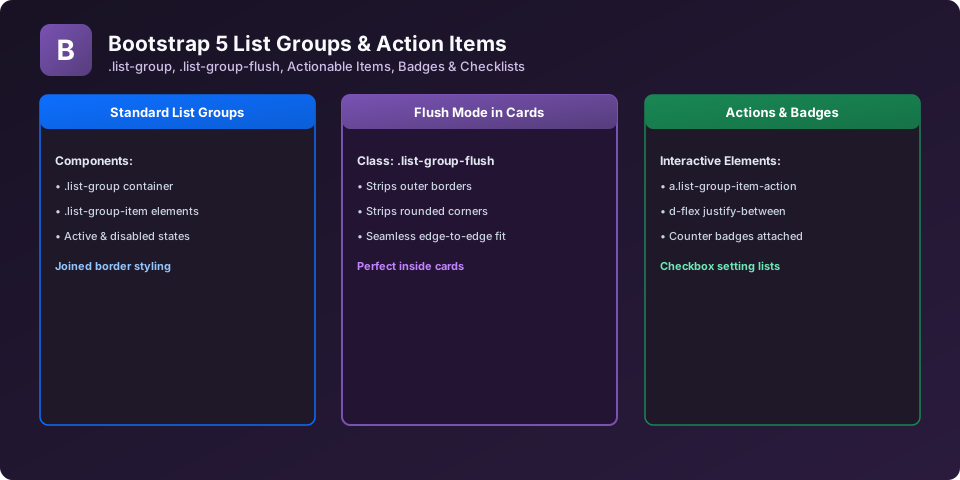
List Groups are versatile components for displaying a series of content items: side navigation menus, search result feeds, task checklists, and dashboard notification streams. Bootstrap 5 supports actionable hover items, badges, and edge-to-edge flush styling.
1. Basic List Group with Notification Badges
Combine flexbox utilities with badges to place unread counts on the right side of list items:
<ul class="list-group shadow-sm" style="max-width: 400px;">
  <li class="list-group-item d-flex justify-content-between align-items-center active" aria-current="true">
    <span><i class="fa fa-inbox me-2"></i> All Messages</span>
    <span class="badge bg-light text-dark rounded-pill">14</span>
  </li>
  <li class="list-group-item d-flex justify-content-between align-items-center">
    <span><i class="fa fa-star me-2"></i> Starred Questions</span>
    <span class="badge bg-primary rounded-pill">3</span>
  </li>
  <li class="list-group-item d-flex justify-content-between align-items-center">
    <span><i class="fa fa-trash me-2"></i> Trash</span>
    <span class="badge bg-secondary rounded-pill">0</span>
  </li>
</ul>
2. Flush List Groups (.list-group-flush)
When embedding list groups inside cards, use .list-group-flush to remove outer borders and rounded corners, creating clean edge-to-edge list dividers:
<div class="card" style="width: 18rem;">
  <div class="card-header fw-bold">Course Modules</div>
  <ul class="list-group list-group-flush">
    <li class="list-group-item">1. Fundamentals</li>
    <li class="list-group-item">2. Components</li>
    <li class="list-group-item">3. Advance Sass</li>
  </ul>
</div>
Explore Related Bootstrap Tutorials & Next Steps
Strengthen your responsive web design mastery by studying these connected classes:
Embed edge-to-edge list groups inside card containers with .list-group-flush.
Place unread counts on the right side of list items using d-flex and ms-auto.
Transform a vertical list group into clickable tab panels.
Build selectable settings lists with embedded checkboxes and radios.
Frequently Asked Questions (FAQ) - Student & Interview Review
<div class='list-group'> and wrap items in <a href='#' class='list-group-item list-group-item-action'>.
<input class='form-check-input me-2' type='checkbox'> inside each .list-group-item to build interactive to-do lists.
.list-group-horizontal class (or responsive variant like .list-group-horizontal-md).
Next Step in Your Bootstrap Learning Path:
Advance your practical frontend engineering skills with the next topic in our synchronized curriculum.
Continue to Class 29: Modals & Dialogs → Previous: ← Class 27: Spinners & Loaders | Full Syllabus


You may also like this!
© Veewom.com. | Managed by PinePL
