
- Home
- Tutorials
- Bootstrap Tutorial
- Position, Display & Size
Bootstrap 5 Position, Display, Visibility, Sizing & Shadows
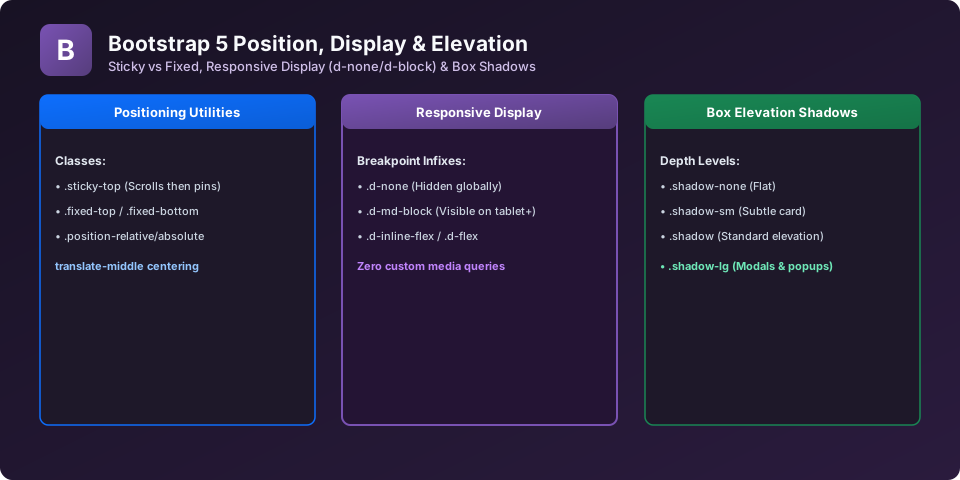
Fine-tuning UI layouts requires precise control over CSS positioning (fixed, sticky, absolute), display behavior (showing or hiding elements based on device breakpoint), dimensions (w-100, h-100), and depth shadows. Bootstrap 5 provides modular classes for all of these properties.
1. Responsive Display Utilities (Show / Hide by Screen Size)
Control element visibility across mobile, tablet, and desktop without custom media queries:
<!-- Visible ONLY on mobile smartphones, hidden on md+ -->
<div class="d-block d-md-none bg-warning p-2">Visible on Mobile Only</div>

<!-- Hidden on mobile, visible on tablet and desktop -->
<div class="d-none d-md-block bg-info text-white p-2">Visible on Tablet & Desktop Only</div>
2. Positioning: Sticky Top & Fixed Bottom
<!-- Stays at top of viewport once scrolled past -->
<div class="sticky-top bg-light p-3 border-bottom">Sticky Header</div>

<!-- Permanently locked to the bottom edge of screen -->
<div class="fixed-bottom bg-dark text-white p-3 text-center">Fixed Footer Bar</div>
3. Box Shadows (Elevation & Depth)
Add material elevation to cards and buttons with shadow utilities:
<div class="shadow-none p-3 mb-3 bg-light rounded">No Shadow (.shadow-none)</div>
<div class="shadow-sm p-3 mb-3 bg-white rounded">Small Subtle Shadow (.shadow-sm)</div>
<div class="shadow p-3 mb-3 bg-white rounded">Regular Shadow (.shadow)</div>
<div class="shadow-lg p-3 mb-3 bg-white rounded">Large Elevated Shadow (.shadow-lg)</div>
Explore Related Bootstrap Tutorials & Next Steps
Strengthen your responsive web design mastery by studying these connected classes:
Pair display and position classes with responsive spacing utilities.
Take full advantage of d-flex, d-inline-flex, and flex directions.
Use position-absolute and translate-middle to place badges on buttons.
Pin headers to the top of the viewport using .sticky-top and .fixed-top.
Frequently Asked Questions (FAQ) - Student & Interview Review
.d-none sets display: none;, completely removing the element from document layout flow. .invisible sets visibility: hidden;, hiding the element visually while preserving its physical space on the page.
.w-100 (sets width: 100% !important;) or .vw-100 (sets width: 100vw;).
top-50 start-50 translate-middle.
Next Step in Your Bootstrap Learning Path:
Advance your practical frontend engineering skills with the next topic in our synchronized curriculum.
Continue to Class 37: Ratio, Stacks & Helpers → Previous: ← Class 35: Flexbox Utilities | Full Syllabus


You may also like this!
© Veewom.com. | Managed by PinePL
